
Bài mẫu ielts writing task 1 line graph tổng hợp các bài mẫu dành cho ielts writing task 1 dạng line graph
Bài mẫu ielts writing task 1 line graph 1 (1)
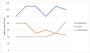
The graph below shows the production levels of main fuels in a European country from 1981 to 2000. Measured in tonnes.
bài mẫu ielts writing task 1 line graph
The given line graph shows the production levels of three main types of fuel (petroleum, coal, and natural gas) in a particular European country, from 1981 to 2000.
Overall, it can be seen that petroleum was by far the most produced type of fuel, while the amount of natural gas being produced was increasing rapidly.
In 1981, the amount of petroleum being produced was around 100 tonnes. It increased steadily over the next few years to reach around 130 tonnes before dropping back to just under 100 tonnes in 1989. It then rose up again to around 130 tonnes in 1995, where it fluctuated slightly until the end of the period.
Coal was the second most produced fuel in 1981, at 80 tonnes. Coal production remained constant until it dropped suddenly down to around 50 tonnes in 1985. It rose back up to just over 70 tonnes in 1987 before slowly declining over the next 13 years to just under 40 tonnes. The production of natural gas remained unchanged at about 40 tonnes until around 1991 when it began to rise exponentially.
Xem thêm: IELTS Writing Task 1 Line Graph
Bài mẫu ielts writing task 1 line graph (2)
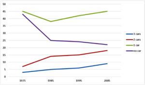
The chart below gives information about car ownership in the UK from 1975 to 2005. (percentage)
bài mẫu ielts writing task 1 line graph
The line graph shows how car ownership in the UK changed between 1975 and 2005.
Overall, the proportion of people who owned two or three cars rose while the figure for those who owned no car declined. Additionally, having one car was the most common situation during the period shown.
In 1975, nearly half of the UK population had one car while people with no car took up a smaller percentage, at roughly 43%. These figures both declined over the following ten years, to around 37% for people having one car and 25% for those with no car. The percentage of those who owned 2 or 3 cars was approximately 7% and 3% respectively in 1975, and both experienced increases over the next 10 years to around 13% and 5% respectively.
Over the next 20 years, the percentage of those with one car gradually rose back up to 45% whereas the percentage of those with no car continued to decline to about 22%. On the other hand, the proportion of people having 2 or 3 cars continued to rise over the following 20 years to 19% and 9% respectively.
Bài mẫu ielts writing task 1 line graph ( 3)
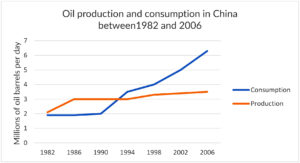
The line graph below shows the oil production and consumption in China between 1982 and 2006.
bài mẫu ielts writing task 1 line graph
The line chart illustrates how much oil was produced and consumed in China from 1982 to 2006.
Overall, it can be seen that there was an upward trend in both the production and consumption of oil during the given period. In addition, oil consumption climbed significantly faster compared to its production over 24 years.
At the beginning of the period, the figures for both oil production and consumption were nearly equal, at around 2 million barrels per day. After 8 years, the amount of oil produced rose significantly by 1 million and remained unchanged until 1994. Meanwhile, that of oil consumed witnessed a stability until 1990, after which it climbed remarkably to 3 million in 1994.
In the second half of the period, the figure for oil production increased slightly to 3.5 million barrels per day. By contrast, the amount of oil consumed grew steadily by 1 million every 4 years, and finally reached a peak of 6 million at the end of the period.
Bài mẫu ielts writing task 1 line graph ( 4)
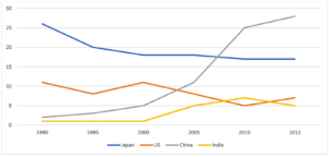
The graph below shows the percentage of Australian exports to 4 countries from 1990 to 2012
bài mẫu ielts writing task 1 line graph
The given line graph illustrates the proportions of Australian products exported to four countries between 1990 and 2012.
In general, while Australian exports to China and India increased over the period, the US and Japan saw a decline in products imported from Australia. In addition, China experienced the biggest increase in exports over the period, making it the biggest export market of Australia from around 2007 onwards.
In 1990, Japan was the leading export market of Australia, receiving over 25% of all exported goods. China, however, received only a mere 5%. By 2012, the percentage of exports to Japan had dropped to below 20%, while the figures for China saw a dramatic rise to almost 30%.
was around ten times higher than the exports to India. Over the following twenty-two years, the figures for the US fluctuated, and dropped to 5% by 2012. The percentage of exports to India, on the other hand, remained unchanged until 2000, and then increased to about 7% in 2010, before dropping slightly to roughly 5% in 2012.
Bài mẫu ielts writing task 1 line graph (5)

bài mẫu ielts writing task 1 line graph
The line chart indicates the sales of five different kinds of jam from 2009 to 2014.
Overall, it can be seen that all types of jam experienced an upward trend in sales except for plum during the given years. In addition, strawberry remained the most popular kind with the highest figure in most of the period.
Starting at 3.2 million units in 2009, the sales of strawberry quickly increased and reached a peak of 7 million at the end of the period. Similarly, the figures for raspberry and grape witnessed the same pattern in which their sales grew considerably and stood at 5.5 million and 4.5 million respectively in 2014.
Moving on, 2.5 million units of plum was sold in 2009. However, this number gradually dropped throughout the period and finally, no unit was recorded in 2014. Regarding cherry, its sales saw a fluctuation around 2 million in the first four years. Then, the figure increased slightly before dropping to 2.5 million in 2014.
Bài mẫu line graph ( 6)
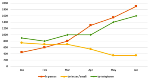
The graph below shows the number of enquiries received by the Tourist Information Office in one city over a six-month period in 2011.
bài mẫu ielts writing task 1 line graph
The line chart illustrates the number of inquiries sent to the Tourist Information Office in a particular city via three means of communication, between January and June in 2011.
It is clear that visitors to the city made more inquires in person and via telephone, while written letters and emails became the least common choices. Additionally, the number of enquiries in person experienced the most dramatic change among the different options.
In January, the Tourist Information Office received 900 telephone enquiries, while just under 800 letters and emails were received. Not many tourists chose to ask for information in person, with just over 400 queries. Over the next three months, the telephone still remained the most popular method of enquiry, at approximately 1000 queries.
Meanwhile, the number of enquires made in person saw considerable growth to 800, surpassing the figures for emails and postal enquires. From March to June, enquires in person were the most common method of inquiry. By June, the number of in person enquires soared by more than 1,000 to peak at 1,900. During this period, there was also a significant rise in the figure for telephone enquiries, from 1000 to 1600. By contrast, fewer people sent emails or letters to make enquires, with slightly less than 400 enquires in May and June.