Writing task 1 bar chart là bài viết tổng hợp các bài mẫu ielts writing task 1 về bar graph
Writing task 1 bar chart sample
Writing task 1 bar chart sample 1
The chart below shows waste collection by a recycling centre from 2011 to 2015.
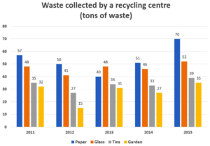
writing task 1 bar chart
The bar chart illustrates how much waste was collected by a recycling centre over five consecutive years, starting in 2011.
It is clear that the total amount of waste collected each year followed similar trends and only fluctuated slightly. Additionally, while waste paper was the most collected type of recyclable waste, the opposite was true for garden waste during the period.
In 2011, paper was the most collected type of waste, at just under 60 tons, while about 50 tons of glass was collected. Meanwhile, there was approximately 35 tons of discarded tin collected, and 32 tons of plastic waste.
The amount of collected waste paper hit the lowest point of approximately 40 tons in 2013 before rising to over 70 tons in 2015, which was the highest figure for all observed years. Meanwhile, the figures for the other types of waste all witnessed fluctuations throughout the period, with 52 tons of glass, 39 tons of tin and 35 tons of garden waste being collected in the last year.
Writing task 1 bar chart sample 2
The charts show average levels of participation in education and the highest education level of adults from 2000 to 2010 in Singapore.
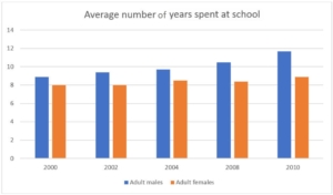
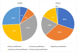
The bar chart illustrates the average number of years males and females attended school, while the pie charts present the different levels of education achieved by adults in Singapore in 2000 and 2010.
Overall, there was an increase in the number of years, for both males and females, that were spent on education. It can also be seen that the figure for males was slightly higher over the period shown. Additionally, the level of education people were attaining had increased over the period.
As can be seen from the bar chart, in 2000, male citizens attended school for an average of 8.9 years, which rose considerably to just under 12 years in 2010. In contrast, the number of years females attended school in 2000 was only 8. This figure remained unchanged until 2008, and then rose to 8.9 years in 2010.
According to the pie charts, in 2000, almost one-third of Singapore’s population finished high school. The figures for those who only finished primary and secondary school were quite high, at approximately 26% each, compared to less than 10% of Singaporeans who had gained a bachelor or master’s degree. However, the level of education people were attaining had increased over the ten year period, with nearly two-thirds of the population obtaining a university degree, and only 2.1% leaving after primary school.
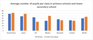
Writing task 1 bar chart sample 3
The bar chart shows the average size class in primary schools and lower secondary schools in 6 countries compared to the world average in 2006.
writing task 1 bar chart
The bar chart illustrates the average class size in primary and secondary schools in six different countries, and compares these figures with the world average.
In general, the world average number of pupils in a lower secondary school class was higher than the figure for primary schools. In addition, Asian countries (South Korea and Japan) had a higher number of students on average in classrooms compared with other countries.
In 2006, South Korea, Japan, and the UK all had larger primary school classes when compared with the world average. South Korea had the largest primary school classes, at around 34 students per class. On the other hand, Mexico, Denmark, and Iceland all had smaller than world average primary school classes, at 20, 23, and 21 students per class respectively.
With regards to lower secondary school classes, South Korea, Japan, and Mexico, all had higher than world average class sizes, with South Korea again having the largest classes, at an average of 36 students per class. The UK, Denmark, and Iceland, all had smaller than world average classes, with 18, 21, and 20 students per class respectively.
Xem thêm: IELTS Writing Task 1 Line Graph
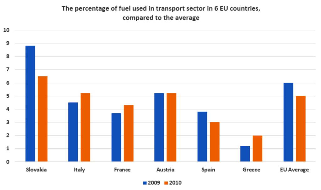
Writing task 1 bar chart sample 4
The chart below shows information about fuel used in the transport sector in different countries in Europe, compared to the EU average, in 2009 and 2010.

writing task 1 bar chart
The bar chart illustrates fuel usage for transportation in six different European nations, and compares these figures to the European average, in 2009 and 2010.
Overall, while the percentage of fuel used in Slovakia and Spain decreased, fuel consumption in Italy, France and Greece saw opposite trends during the research period. Additionally, the European average was higher than the figures for all countries, except for Slovakia.
In 2009, the transportation sector in Slovakia consumed nearly 7% of the total fuel, about
2% higher than in Austria. Italy used about 4.5% of fuel in transportation, compared to approximately 1% in Greece, which was the lowest figure shown on the chart. Meanwhile, fuel consumed for transportation in the other countries accounted for just under 4% of total fuel usage in each.
In 2010, the figure for Austria remained unchanged, at just over 5%, and slightly less fuel was used for transportation in Slovakia and Greece as illustrated by decreases to just over 6% and 2% respectively. In contrast, Italy, France, and Greece all experienced increases of roughly 1% in fuel consumption.
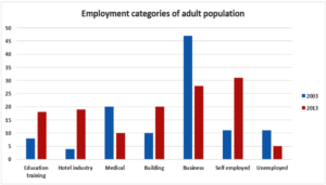
Writing task 1 bar chart sample 5
The chart shows the employment status of adults in the US in 2003 and 2013.
ielts writing task 1 sample bar chart
The given bar chart illustrates the percentage of American adults in different fields of employment from 2003 to 2013.
In general, it can be seen that there were increases in the percentages of people working in education training, the hotel industry, the building industry, and the self-employment sector, while the medical, and business sectors saw decreases over this ten-year period. The unemployment rate also significantly dropped during this time.
In 2003, approximately 8%, 3%, and 10% of American adults were employed in education training, the hotel industry, and building respectively. The figures for these fields all rose to around 20% over the following ten years. Additionally, the percentage of self-employed people almost tripled, from around 10% to just over 30% during the period.
In 2013, around a quarter of the American working population chose to run their own businesses, which had seen a two-fold decrease from 2003. Similarly, percentages of those in the medical industry also dropped by half, from 20% to 10%, over the period.
Bài mẫu ielts writing task 1 line graph
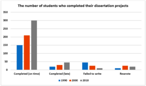
Writing task 1 bar chart sample 6
The chart shows the number of students in a UK university who completed (on time or late), failed to write, and rewrote their dissertation in 1990, 2000, 2010.
ielts writing task 1 sample bar chart
The bar chart compares figures relating to the completion of dissertation projects by students at a university in the UK in 1990, 2000, and 2010.
Overall, it is clear that the majority of students finished their dissertations on time, in all three measured years. It is also worth noting that the number of dissertations completed significantly increased over the period.
In 1990, approximately 150 students submitted their dissertations by the completion deadline, as opposed to around 20 students who completed it late. Meanwhile, just under 50 students failed to write their thesis, while approximately 10 students had to rewrite theirs.
20 years later, the number of dissertations that were completed on time had doubled, to 300, while the number of late submissions had more than doubled, to just under 50. Significantly fewer students failed to write their dissertation, as illustrated by an approximate threefold decline, and the figures for students that rewrote their dissertations rose, to roughly 25 by 2010.
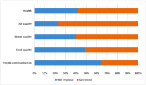
Writing task 1 bar chart sample 7
The bar chart shows expectation to change of European young people in the next 20 years in 5 different areas.
writing task 1 bar chart
The graph illustrates young people’s expectations for change in five different aspects of European life over the next 20 years.
Overall, the majority of the surveyed youth expect that, besides the communication between people, all other surveyed aspects of life will get worse.
Looking at the graph in more detail, it can be seen that 77% of people surveyed expected to see a decline in air quality, which was over three times more than the number of people who believed otherwise. Similarly, over half of the surveyed youth believed that the quality of health, as well as water, would decline over the next 20 years, with the figures being 58% and 60% respectively.
In contrast, the majority of people participating in the survey expected to see improvements in the communication between people, at 64%, while only 36% of them thought the opposite. Meanwhile, opinions on food quality were divided almost equally with just over half the survey participants believing that things would improve, and 49% thinking the opposite.
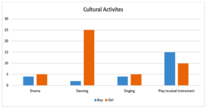
Writing task 1 bar chart sample 8
The charts show the percentage of boys and girls aged 5-14 taking part in cultural
activities and sports in Australia in 2003.

writing task 1 bar chart
The given bar charts illustrate the proportions of Australian boys and girls aged 5 to 14 years-old who participated in sports and different cultural activities in 2003.
In general, it can be seen that while dancing was the most popular cultural activity for girls, boys had a strong tendency for playing musical instruments. With regards to sports, a higher percentage of boys participated in sports activities compared to girls in the same age group.
In 2003, 5% of girls aged 5 to 14 participated in drama and singing activities, which was approximately 2% higher than the figure for boys in the same activities. Meanwhile, 25% of girls took part in dancing activities, compared to only 2% of boys. In contrast, the proportion of girls that played a musical instrument was only 10%, which was only two-thirds of the figure for boys in the same category. When it came to playing sport, there was a participation rate of about 70% of 5 to 14 year-old boys, which was around 20% higher than that of girls, at just over 50%.
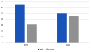
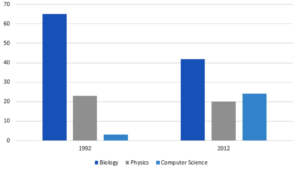
Writing task 1 bar chart sample 9
The chart gives information about the proportion of students choosing different science subjects in a university in 1992 and 2000
writing task 1 bar chart
The bar charts show the percentage of undergraduates choosing three different science subjects in 1992 and 2012.
In general, there were more male than female students learning science subjects in the given two years. Additionally, biology was most chosen by the students, while those learning physics and computer science took up smaller proportions.
In 1992, nearly 70% of the students were males, while their counterparts only accounted for 30%. Over the following 10 years, despite a growth of 10%, the percentage of female students was still lower than that of males which declined to under 50% in 2012.
Biology was preferred by approximately 65% of the students in 1992, which was nearly triple the figure for physics, at only 20%. Computer science, on the other hand, was the least chosen subject, at under 5%. The year 2012 witnessed a significant drop in the proportion of biology learners, from 65% to over 40%, whereas the figure for physics remained unchanged at 20%. Computer science became more popular with its percentage increasing substantially to over 20%.
Writing task 1 bar chart sample 10
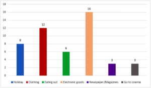
writing task 1 bar chart
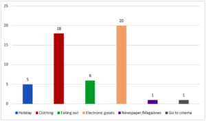
The charts give information about how people in a European country spent their money on different commodities and services in 1998 and 2008.
In general, the proportions of expenditure on electronic goods and clothing were the highest in both surveyed years. Additionally, most of the given categories saw a decrease
in their figures, while the expenses for clothing and electronic goods occupied larger proportions of people’s spending.
In 1998, 16% of people’s budget was spent on electronic goods, which was 4% higher than the percentage spent on clothing. Meanwhile, the amount of money spent on holidays and eating out accounted for 8% and 6% respectively. Only 3% of people’s expenditure was used to purchase newspapers and magazines, and an additional 3% for
going to the cinema.
The proportion of money spent on clothing rose by 6% in 2008, while that of electronic goods saw a 4% growth. In contrast, the percentage of expenditure used for taking holidays dropped to 5%, while that of eating out remained unchanged. Notably, people reduced their spending on newspapers and magazines, and going to the cinema, down
to 1% for each.
Writing task 1 bar chart sample 11
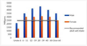
The chart shows the information about salt intake in the US in 2000.
writing task 1 bar chart
The bar chart compares the amount of salt consumed by Americans in different age groups in 2000.
Overall, it is clear from the chart that men had a higher salt intake than women in all age groups. Additionally, except for children under 6 and females over 60, most people consumed significantly more salt than the recommended adult intake.
The amount of salt consumed by men in their twenties and thirties was the highest, at 4500 mg, which was slightly higher than the figures for 12-19 year-olds and over-60 year-olds, at 3500 mg. Meanwhile, males aged 6-11 and 40-60 years-old consumed 4000 mg of salt, which was roughly double the intake of boys under 6.
Regarding females, those aged under 6 consumed approximately 1200mg, while those aged between 6 and 60 consumed nearly three times that figure, at around 3000 mg. Women over 60 were the only group that consumed the recommended amount of salt, at 2500 mg.
Writing task 1 bar chart sample 12
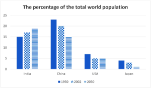
The bar chart shows the percentage of the total world population in 4 countries in 1950 and 2003, and projections for 2050.
writing task 1 bar chart
The bar chart illustrates the proportion of the total world population in four countries (India, China, USA and Japan) in 1950, 2002, and predicted figures for 2050.
Overall, the figures for the proportion of world population decreased for all countries except India. Additionally, India is the only country where the proportion of world population is expected to have increased by 2050.
In 1950 and 2002, China made up the greatest proportion of world population, despite a slight decrease in its figures from approximately 23% to 20%. Similarly, the USA and Japan also experienced a decline of around 2% over the same period, with figures at around 5% and 2.5% respectively in 2002. In contrast, the opposite could be seen in India where the figure increased from approximately 15% to 17% in 2002.
In 2050, the figures for China and Japan are predicted to continue to drop to around 15% and 2% respectively, while the figure for the USA is likely to remain unchanged, at 5%. Meanwhile, India’s percentage of world population is projected to continue rising to 19%.
Writing task 1 bar chart sample 13
In many countries, people in big cities either live alone or in small family units, rather than in large, extended family groups. Is this a positive or negative trend?
writing task 1 bar chart
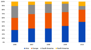
The bar chart illustrates the percentages of vehicles sold in four different regions by a car manufacturer, over five consecutive years, starting from 2006.
It is clear that while the proportion of cars sold in Asia increased significantly, the opposite was true in South America. Additionally, the figures for the remaining regions remained relatively stable over the period shown.
In 2006, 30% of cars were sold in Asia and Europe each, just 1% higher than in South America. By contrast, the car sales in North America made up by far the lowest percentage of total sales, at only 11%. Two years later, the proportion of car sales in Asia and Europe both rose moderately, with Europe’s sales peaking at 38% in 2008, whereas there were considerable decreases in the figures for the other regions.
By 2010, the percentage of cars sold in Asia had soared to reach 50%, while those in Europe and South America had declined significantly to 30% and 9% respectively. Meanwhile, the sales in North America, which had dropped to 5% in 2009, had recovered to 11%.